This is not really a tutorial for getting started with Custom Fonts but is aimed at those who have some experience of using Custom Font Tools.
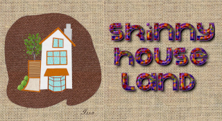
Here is a recent example of the style that I am interested in.

You can access a pdf version of this guide here:
Attachment:
 Guide to Cut Away Custom Fonts.pdf [835.08 KiB]
Downloaded 380 times
Guide to Cut Away Custom Fonts.pdf [835.08 KiB]
Downloaded 380 times
And a zipped resources folder containing a custom font character path file and copies of some potentially useful custom font plug-ins:
Attachment:
 Resources.zip [94.14 KiB]
Downloaded 281 times
Resources.zip [94.14 KiB]
Downloaded 281 times
The basic idea is to use two weights of the same font – a thick and a thinner version – and cut away sections of the thicker font to reveal portions of the thinner font below. The two separate fonts can be decorated in whatever style you choose and can then be re-combined as a single font.
This guide uses Custom Paths to generate the base fonts with the thick and thin weights. You can search the Resources thread on GimpChat for suitable custom path files (or click on the link in my signature) but the accompanying Resources folder contains a file of character paths called Informal_Style.xcf and copies of the plug-ins for you to download and use.
If you do not already have the custom font plug-ins, install them in your user plug-ins folder. Save the custom path file to a location of your choice.
Open the Custom Path file from the file menu:
File>>Open…Navigate to the file location and click on OK.

Don’t worry if you cannot see any character paths! They are there in the path tool dock. Scroll down past the kerning paths and you will find them.
Set the foreground colour that you want to use for the characters and call up the Custom Font Paths to Layers dialog:
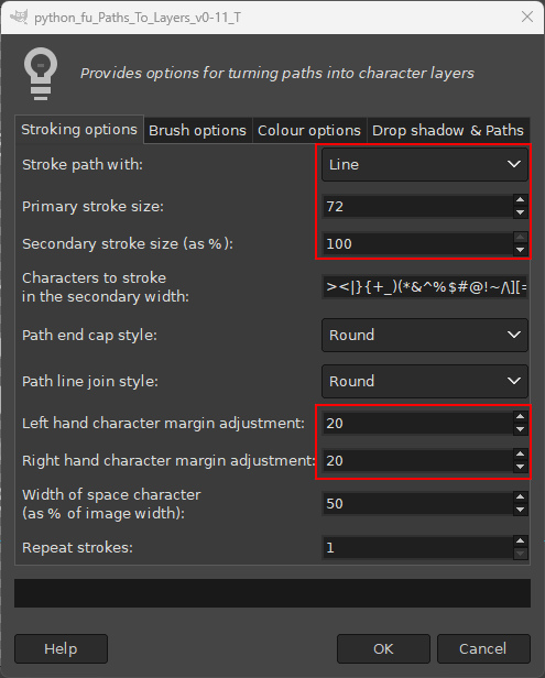
Filters>>Custom Fonts>>Constructing Tools>>Custom Font Paths to Layers v.0.11 Tabbed...Change the default options and use those values shown in the boxes highlighted below. (If you want the filter to remove the character paths from the output, use the relevant option on the ‘Drop shadow & Paths’ tab in the dialog.)
When you are ready click on ‘OK’.
This should create a set of thicker characters. Save the file with a suitable name. The image below shows the layers and paths tool docks preview panes.

Load the character paths file again and run the ‘Paths to Layers’ plug-in again.
Use the new values, highlighted below, to create a thinner set of characters.
NB. If you want to use different values just make sure that the total of the values for the stroke width and the two margins adds up to the same amount as for the thicker font values. This will make certain that the character layers are centred when recombining later.
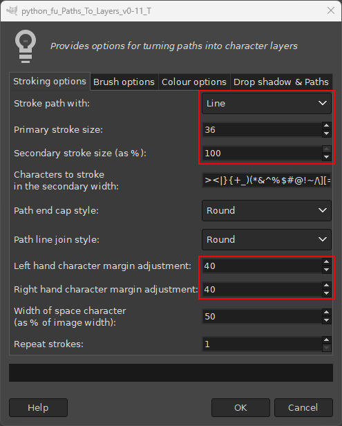
The second file output:
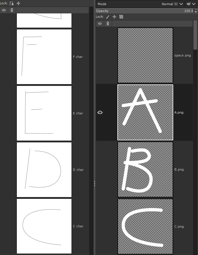
Save with a new name for later use.
The next step is to cut away sections of the thicker custom font. This has to be done by hand to make the most of the font shapes – there is a slow way and even slower way.
The Slow Way:
Go through each character layer of the custom font and use one of the selection tools to select the area, or areas, of each character that you want to lose.

Clear the selected area of the layer (hit the Delete key) to remove unwanted areas of the character.
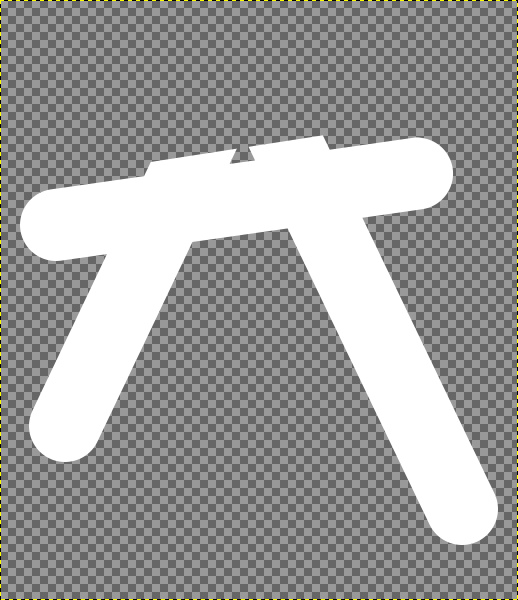
Or with a little more adventurous pruning…

The Even Slower Way…
Open both the thicker and the thinner versions of the custom font files.
Select a thinner character and copy it (Ctrl +C).
Paste it into the thicker version (Ctrl+Alt+P).
Move the position of the copied layer within the layer tree so that it is just above the same character layer (with both layers visible).

Lower the opacity of the thicker character so that you can also see the thinner character.
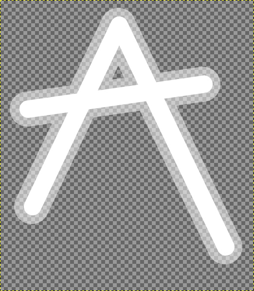
Now apply your selecting and cutting process (to the thicker active layer of course). You can be certain of the best place to apply your cuts to reveal the font underneath using this method.
Delete the thinner layer and return the opacity of the thicker layer back to 100%.
The next two images illustrate the basic effects of both cuts applied above: Obviously decorative textures have yet to be applied to both custom fonts.


Now all you have to do is to finish off the selection and clearing process for all the other characters.
When you have your two versions of the custom font files saved and ready you can apply your decorative finishes to each version; let your creative juices flow!
My decorative finishes were as follows…
For the thinner weight custom font:
Apply a highlight with Custom Font Highlights.
Add a coloured texture using overlay mode with Custom Font Facemaker.
Apply another copy of this coloured text using grainmerge mode with Custom Font Facemaker.
Add an extra highlight effect with Custom Font Selection Highlight.

For the thicker weight custom font version:
Add a highlight with Custom Font Highlights.
Add a coloured texture with Custom Font Facemaker using overlay mode.
Add another copy of the texture using grainmerge mode with Custom Font Facemaker.
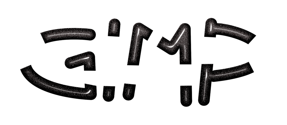
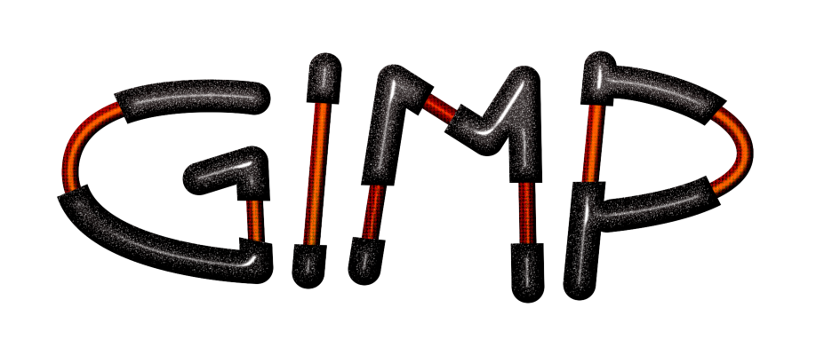
Finally with the thinner weight as the active image I used the ‘Combine’ option in Custom Font Facemaker (normal mode) to place the thicker weight characters on top of the thinner weight characters.
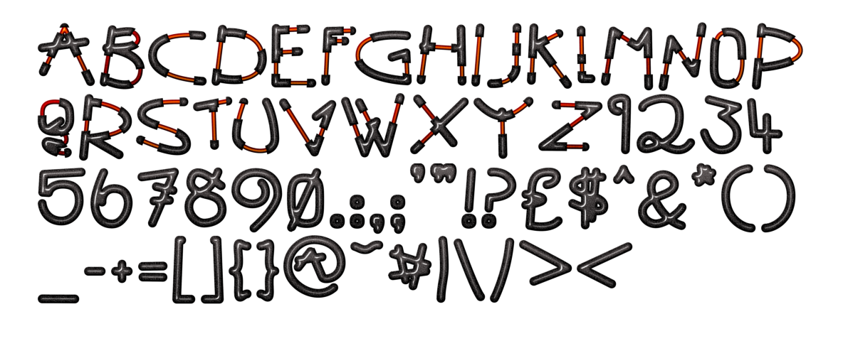
I only applied the cut away effect to the upper-case characters…
Have fun...
 Login
Login Register
 Tweets
 FAQ
FAQ Advanced Search







 (I'll definitively try to do it)