Nicely done mackenzieh and Wallace

I'm using inner shadow instead of bevel.
It seems that they had lifted the small letters upwards a bit in the old logo.
The "l" letter is also bending slightly right in the font file, but in the logo it was straight.
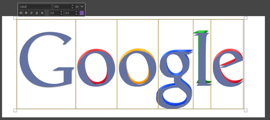
Disregarded details to keep the text information of original layer.
1920x740 canvas
Font: Catull, 550. Letter spacing -8.0
Highlighted letters individually, used blue, red, green and yellow to color.
Layer Effects:
Drop Shadow: Direction 100, size 10, opacity 60. Rest settings default.
Inner Shadow: Blend mode grain merge, opacity 100, angle 120, distance 0, edge, choke 34, size 78.
Duplicate layer.
Inner Shadow: Blend mode Addition, opacity 35, angle 120, distance 12, Choke 34, Size 78.

 Login
Login Register
 Tweets
 FAQ
FAQ Advanced Search