It is currently Fri Aug 07, 2026 9:59 pm


All times are UTC - 5 hours [ DST ]


Post new topic Reply to topic  [ 15 posts ] 
Author Message
 Post subject: A pretty cool looking free font
PostPosted: Mon Oct 03, 2011 2:12 am  (#1) 
Offline
Global Moderator
User avatar

Joined: May 16, 2010
Posts: 16152
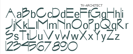
I get a free font daily from Font101.com (you can sign up for the free email dl yourself on their site).
Anyways they sent me this one today, and i thought it looked pretty cool.

Image

http://fonts101.com/search/tk+architec.aspx

_________________
Image


Share on Facebook Share on Twitter Share on Orkut Share on Digg Share on MySpace Share on Delicious Share on Technorati
Top
 Post subject: Re: A pretty cool looking free font
PostPosted: Mon Oct 03, 2011 4:39 am  (#2) 
Offline
GimpChat Member
User avatar

Joined: Sep 06, 2011
Posts: 368
Location: US, Ohio
Freakin sweet. It actually does look like an engineer/architect's ansi handwriting. That's pretty awesome.


Top
 Post subject: Re: A pretty cool looking free font
PostPosted: Mon Oct 03, 2011 4:45 am  (#3) 
Offline
GimpChat Member
User avatar

Joined: Apr 07, 2010
Posts: 14182
thanks Rod, Kewl font

_________________
Image


Top
 Post subject: Re: A pretty cool looking free font
PostPosted: Mon Oct 03, 2011 5:01 am  (#4) 
Offline
Global Moderator
User avatar

Joined: May 16, 2010
Posts: 16152
You guys are welcome.
They have some really cool fonts there.That is why i signed up for their free font a day newsletter. :)

_________________
Image


Top
 Post subject: Re: A pretty cool looking free font
PostPosted: Mon Oct 03, 2011 6:27 am  (#5) 
Offline
GimpChat Member
User avatar

Joined: Sep 12, 2011
Posts: 377
Location: UK
Nice font Rod thanks


Top
 Post subject: Re: A pretty cool looking free font
PostPosted: Tue Oct 04, 2011 8:35 am  (#6) 
Offline
GimpChat Member
User avatar

Joined: Jul 04, 2011
Posts: 395
Location: Indianapolis, IN
Cool!

I'm always on the look out for different fonts. I've always used DaFont but they have no font of the day kind of thing.

I did put in for that Font101! Good find!

Thanks!

_________________
"That which does not kill us makes us stronger." ~ Friedrich Nietzsche


Top
 Post subject: Re: A pretty cool looking free font
PostPosted: Tue Oct 04, 2011 10:21 am  (#7) 
Offline
Retired Staff
User avatar

Joined: May 22, 2008
Posts: 6946
Location: Somewhere in GIMP
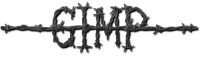
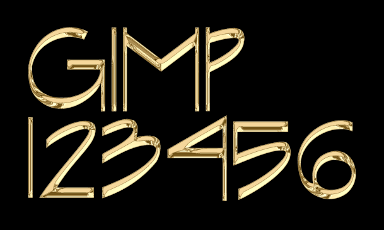
It's a beautiful font but it needs repairing. I love the numbers! The upper case I and the number 1 are too skinny and putting the upper case I next to a letter that has a straight side makes the I disappear.

This is the word HIM using the font.

Image

This is the result of using Graechan's metallica script. GIMP in all caps makes the I disappear like in the word HIM above.
Image

I'm seeing if it can be repaired over in the fonts newsgroup in Annex Cafe.

_________________
Image
World War IV will be fought with sticks and stones. - Albert Einstein


Top
 Post subject: Re: A pretty cool looking free font
PostPosted: Tue Oct 04, 2011 11:42 am  (#8) 
Offline
Global Moderator
User avatar

Joined: May 16, 2010
Posts: 16152
Time for some letter kerning! :)

_________________
Image


Top
 Post subject: Re: A pretty cool looking free font
PostPosted: Tue Oct 04, 2011 1:54 pm  (#9) 
Offline
Retired Staff
User avatar

Joined: May 22, 2008
Posts: 6946
Location: Somewhere in GIMP
Character over in Annex Cafe repaired the font and made it much better. This is what he said.
Character in Annex Cafe fonts wrote:
TK-Architect is a terribly made version of the classical font "Graphite" available in many varieties from Linotype and Monotype. It was completely redrawn and so is not a clone.

None of the letters have any space on either side. And you can't even cheat by using the 'space', because it's w-a-a-y too wide. The lack of kerning makes it even worse.

So here's a modified version, with a new name (to avoid confusion), TK-Architect II.

Changes:
Re-sized slightly; reduced by about 10%.
Sidebearings added to all glyphs.
The space was narrowed by about 50%
Upper case copied to lower case for typing and display convenience.
EXCEPTIONS: The LC i and t are slightly fatter than the UC.
The ampersand was moved from the at-sign position to where it belongs
An at-sign was added
The font was auto-kerned, so combos like AVA no longer look like A V A

Hope this helps!

- Character

I've attached the repaired font. You will need to delete the original one in your fonts folder first.
Repaired font
Image


Attachments:
TK-ARCHITECT II.ttf.zip [12.63 KiB]
Downloaded 216 times

_________________
Image
World War IV will be fought with sticks and stones. - Albert Einstein
Top
 Post subject: Re: A pretty cool looking free font
PostPosted: Tue Oct 04, 2011 2:26 pm  (#10) 
Offline
GimpChat Member
User avatar

Joined: Apr 07, 2010
Posts: 14182
thanks O

_________________
Image


Top
 Post subject: Re: A pretty cool looking free font
PostPosted: Tue Oct 04, 2011 2:30 pm  (#11) 
Offline
GimpChat Member
User avatar

Joined: Apr 09, 2011
Posts: 1764
Nice! Thank you


Top
 Post subject: Re: A pretty cool looking free font
PostPosted: Fri Oct 07, 2011 12:28 am  (#12) 
Offline
GimpChat Member
User avatar

Joined: Jul 04, 2011
Posts: 395
Location: Indianapolis, IN
Rod wrote:
I get a free font daily from Font101.com (you can sign up for the free email dl yourself on their site).
Anyways they sent me this one today, and i thought it looked pretty cool.
http://fonts101.com/search/tk+architec.aspx


Rod .. have you been getting the daily font list? I signed up for it and haven't gotten anything. I even contacted them via email and no response. =((

_________________
"That which does not kill us makes us stronger." ~ Friedrich Nietzsche


Top
 Post subject: Re: A pretty cool looking free font
PostPosted: Sat Oct 08, 2011 12:59 am  (#13) 
Offline
GimpChat Member
User avatar

Joined: Oct 07, 2010
Posts: 439
Location: home/Nixnine/.gimp-2.0/scripts/nixnine.scm
I like the font, but the "I" and the "1" are too skinny. I edited the font to make them fatter. But are they too fat now? On the "1" I tried to make it as thick as the thickest part of the other numbers. Same with the "I".
I need to adjust the spacing again. The right side of the "I" is too much also.
Opinions?


Attachments:
arch.png
arch.png [ 85.88 KiB | Viewed 2321 times ]

_________________
I refuse to be confused, but am often confused at this refusal.
Top
 Post subject: Re: A pretty cool looking free font
PostPosted: Sat Oct 08, 2011 1:17 am  (#14) 
Offline
Retired Staff
User avatar

Joined: May 22, 2008
Posts: 6946
Location: Somewhere in GIMP
Looks great Nix!

_________________
Image
World War IV will be fought with sticks and stones. - Albert Einstein


Top
 Post subject: Re: A pretty cool looking free font
PostPosted: Sat Oct 08, 2011 7:30 pm  (#15) 
Offline
GimpChat Member
User avatar

Joined: Apr 07, 2010
Posts: 14182
That is so cute O...love the little flower you added. That is a very nice font.

_________________
Image


Top
Post new topic Reply to topic  [ 15 posts ] 

All times are UTC - 5 hours [ DST ]


* Login  


Powered by phpBB3 © phpBB Group