It is currently Sat Aug 08, 2026 5:21 pm


All times are UTC - 5 hours [ DST ]


Post new topic Reply to topic  [ 116 posts ]  Go to page Previous  1, 2, 3, 4, 5, 6  Next
Author Message
 Post subject: Re: 2 tons of gold
PostPosted: Sat Oct 05, 2013 10:55 am  (#61) 
Offline
GimpChat Member
User avatar

Joined: Apr 08, 2010
Posts: 5420
Location: Northwest Ohio
Molly, that last nickel looks sooooo real, even if a wee bit on the blue side.


Top
 Post subject: Re: 2 tons of gold
PostPosted: Sat Oct 05, 2013 11:00 am  (#62) 
Offline
GimpChat Member
User avatar

Joined: Apr 08, 2010
Posts: 5420
Location: Northwest Ohio
This has been very informative using this method...I never realized that you could make and use several bump maps on the same layer! So here is one where each section is from a different bump map. It's rather ugly as it's just a practice, but I have learned tons from it.
Image


Top
 Post subject: Re: 2 tons of gold
PostPosted: Sat Oct 05, 2013 11:27 am  (#63) 
Offline
GimpChat Member
User avatar

Joined: Jul 17, 2012
Posts: 2769
2-ton wrote:
Molly, that last nickel looks sooooo real, even if a wee bit on the blue side.
yeah, thats because its a real one :mrgreen:


Top
 Post subject: Re: 2 tons of gold
PostPosted: Sat Oct 05, 2013 11:39 am  (#64) 
Offline
GimpChat Member
User avatar

Joined: Apr 08, 2010
Posts: 5420
Location: Northwest Ohio
LOL


Top
 Post subject: Re: 2 tons of gold
PostPosted: Sat Oct 05, 2013 12:12 pm  (#65) 
Offline
GimpChat Member
User avatar

Joined: Apr 08, 2010
Posts: 5420
Location: Northwest Ohio
GnuTux wrote:
Looking good, 2-ton!

The hue shift is basically a color change toward more a darker copperish gold, rather than a lighter yellow gold. As far as getting an engraved -vs- embossed effect, that is normally achieved by inverting the Bump Map. To me though, it seems the result is dependent on the colors used and the size & shape of the image. More often than not, if I stare at the bump, it becomes an optical illusion, sometimes looking like it's embossed and sometimes looking engraved, kinda like the old wire frame box effect.

At times, I can a better engraved effect by creating a darker inner shadow on one side and a lighter outer shadow on the other side (or an overall glow). In the following, I hue shifted and added an inner shadow to the bump mapped text.

[ Image ]


hmmm, maybe using layer/fx bevel and emboss, inner bevel and direction down might work as a lazy man's way.


Top
 Post subject: Re: 2 tons of gold
PostPosted: Sat Oct 05, 2013 12:48 pm  (#66) 
Offline
GimpChat Founder
User avatar

Joined: May 22, 2008
Posts: 5241
Location: Gimpville
Nice results! :yes

@Molly, you could use the same emap you used on the Canadian cent and just tweak the hue/saturation/color balance & contrast levels to add in a hint of blue. Here's a quickie attempt but you could do a lot better.

Image

@2-ton, yes, that is the kind of thing I was suggesting, either with layer-fx, gc-shadow or whatever script you use. I'm sure you already know but it should be mentioned that much crisper results can be had by not blurring the text in the bump maps, just using black text on a white background. Only blur when a bevel is needed.

_________________
“If you reach for the stars, you just might land on a decently sized hill.” - Stuart Hill


Top
 Post subject: Re: 2 tons of gold
PostPosted: Sat Oct 05, 2013 1:03 pm  (#67) 
Offline
GimpChat Member
User avatar

Joined: Apr 07, 2010
Posts: 14182
Thank you Tux. I didn't think of that, sounds reasonable. I will give it a try and then play with the saturation and see how it goes.

EDIT: Here is my last nickel. I will also post the xcf in case someone wants to play with the BASE layer. I am going to go on to somethang else now, Maybe a Toonie or a Loonie... :teeth
Image


Attachments:
nickel-1958.xcf [1.86 MiB]
Downloaded 554 times

_________________
Image
Top
 Post subject: Re: 2 tons of gold
PostPosted: Sun Oct 06, 2013 8:26 am  (#68) 
Offline
GimpChat Member
User avatar

Joined: Apr 08, 2010
Posts: 5420
Location: Northwest Ohio
Isn't the toonie bi-colored? That would be quite the challenge!


Top
 Post subject: Re: 2 tons of gold
PostPosted: Sun Oct 06, 2013 9:04 am  (#69) 
Offline
GimpChat Member
User avatar

Joined: Apr 07, 2010
Posts: 14182
Yes it is 2-ton Image

_________________
Image


Top
 Post subject: Re: 2 tons of gold
PostPosted: Sun Oct 06, 2013 9:20 am  (#70) 
Offline
GimpChat Founder
User avatar

Joined: May 22, 2008
Posts: 5241
Location: Gimpville
Very nice, Mollly! :jumpclap

_________________
“If you reach for the stars, you just might land on a decently sized hill.” - Stuart Hill


Top
 Post subject: Re: 2 tons of gold
PostPosted: Sun Oct 06, 2013 10:26 am  (#71) 
Offline
GimpChat Member
User avatar

Joined: Sep 22, 2012
Posts: 2089
Location: US
Awesome work molly. I can't actually tell what coins are real and what are not! :wow
Can you do banknotes too, like a hundred dollar bill? :roll:


Top
 Post subject: Re: 2 tons of gold
PostPosted: Sun Oct 06, 2013 10:36 am  (#72) 
Offline
GimpChat Member
User avatar

Joined: Aug 11, 2013
Posts: 123
Location: Ohio
molly wrote:
Yes it is 2-ton [ Image ]


Super cool! Molly! :hi5

_________________
Image


Top
 Post subject: Re: 2 tons of gold
PostPosted: Sun Oct 06, 2013 10:49 am  (#73) 
Offline
GimpChat Member
User avatar

Joined: Jul 17, 2012
Posts: 2769
too bad molly didnt make that :rofl


Top
 Post subject: Re: 2 tons of gold
PostPosted: Sun Oct 06, 2013 12:41 pm  (#74) 
Offline
GimpChat Member
User avatar

Joined: Apr 07, 2010
Posts: 14182
Glad you pointed that out Esper, I wouldn't have known.
Tux, that is just a sample for 2-ton to see what the toonie looks like. I am still working on the Gimp version which is a lot harder than it looks

Kite, thanks, I wish I was good enough to make it like that. when I figure out how to do bank notes, I will send some to y'all.

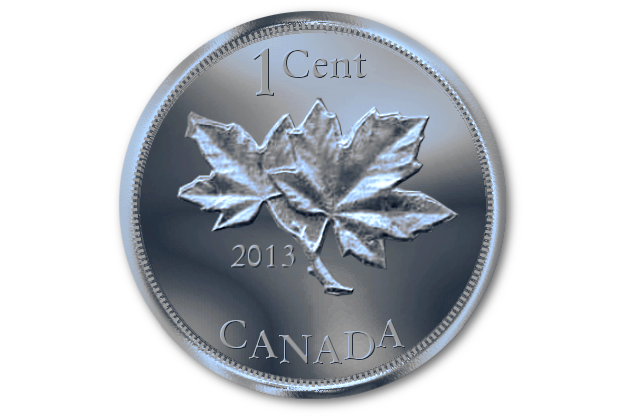
I am trying to get this text curved like on the coin but I can't get the letters to follow the curve. I can raise and lower each letter but they are still straight up and down. I would have to do a layer to each of them unless someone knows of a better way. Here is what I mean.
Image

_________________
Image


Top
 Post subject: Re: 2 tons of gold
PostPosted: Sun Oct 06, 2013 1:37 pm  (#75) 
Offline
GimpChat Member
User avatar

Joined: Aug 11, 2013
Posts: 123
Location: Ohio
molly wrote:
Glad you pointed that out Esper, I wouldn't have known.
Tux, that is just a sample for 2-ton to see what the toonie looks like. I am still working on the Gimp version which is a lot harder than it looks

Kite, thanks, I wish I was good enough to make it like that. when I figure out how to do bank notes, I will send some to y'all.

I am trying to get this text curved like on the coin but I can't get the letters to follow the curve. I can raise and lower each letter but they are still straight up and down. I would have to do a layer to each of them unless someone knows of a better way. Here is what I mean.
[ Image ]


Molly, I'm taking a guess, but I think your talking about "text along a path". If so, this video, http://www.youtube.com/watch?feature=pl ... 08RrdIQ99s, was a great help to me. There is a second video that goes along with it, to do the bottom part also.

_________________
Image


Top
 Post subject: Re: 2 tons of gold
PostPosted: Sun Oct 06, 2013 1:41 pm  (#76) 
Offline
GimpChat Member
User avatar

Joined: Apr 07, 2010
Posts: 14182
Geepers Rellik419, I feel so stupid. I even did a tutorial on that and forgot all about it. Shame on me. :oops: :oops: Here it is right here. :oops: :oops: :oops:
viewtopic.php?p=84266#p84266

_________________
Image


Top
 Post subject: Re: 2 tons of gold
PostPosted: Sun Oct 06, 2013 1:42 pm  (#77) 
Offline
GimpChat Founder
User avatar

Joined: May 22, 2008
Posts: 5241
Location: Gimpville
@ Molly - I thought you had made another giant leap forward. :hehe

Here is my attempt at a buffalo nickle. The buffalo is a little flat and the background still needs some work but it's a start.

Image

_________________
“If you reach for the stars, you just might land on a decently sized hill.” - Stuart Hill


Top
 Post subject: Re: 2 tons of gold
PostPosted: Sun Oct 06, 2013 1:58 pm  (#78) 
Offline
GimpChat Member
User avatar

Joined: Apr 07, 2010
Posts: 14182
Very nice job Tux, the embossing looks real. I like that better than the bump map I used.

_________________
Image


Top
 Post subject: Re: 2 tons of gold
PostPosted: Sun Oct 06, 2013 2:03 pm  (#79) 
Offline
GimpChat Founder
User avatar

Joined: May 22, 2008
Posts: 5241
Location: Gimpville
molly wrote:
Very nice job Tux, the embossing looks real. I like that better than the bump map I used.

I need to add shading to the give the buffalo some muscle tone, then scale down the background bumps a little and I think I'll be closer.

_________________
“If you reach for the stars, you just might land on a decently sized hill.” - Stuart Hill


Top
 Post subject: Re: 2 tons of gold
PostPosted: Sun Oct 06, 2013 2:07 pm  (#80) 
Offline
GimpChat Member
User avatar

Joined: Aug 11, 2013
Posts: 123
Location: Ohio
molly wrote:
Geepers Rellik419, I feel so stupid. I even did a tutorial on that and forgot all about it. Shame on me. :oops: :oops: Here it is right here. :oops: :oops: :oops:
viewtopic.php?p=84266#p84266


:rofl Well, I'm glad I was able to jog your memory. :teeth

The bottom part of the curved text was what always gave me fits. That's how I found that vidoe.

_________________
Image


Top
Post new topic Reply to topic  [ 116 posts ]  Go to page Previous  1, 2, 3, 4, 5, 6  Next

All times are UTC - 5 hours [ DST ]


cron

* Login  


Powered by phpBB3 © phpBB Group