An interesting question, and one I've had lots of chance to practice solving recently.
There's several ways to accomplish this, it all depends on what kind of button you want to make. What's the surface like, grungy? Smooth? Shiny? Plasticky? What's the light direction? If you're making buttons for a UI (which is likely...), you'll want the light source to be consistent accross all lighting elements. Most of the time you can pretty much get away with using the "standard light direction", which is diagonally from the top left corner. It's pretty much standard in UI design.
Anyway... in order for the button metaphor to make sense, your button should have some kind of 3d-effect going on, otherwise it's just a clickable UI element and you can pretty much just forget "pressed down" and have the clicked state be just whatever looks good, like maybe a colour/lightness change.
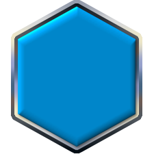
If you want to go with a 3d-style button thing, I think you can start with a bevel on the edges. Keep it subtle, too strong beveling looks cheesy and cheap. Add a linear gradient, it'll look more stylish than a radial one. Then for the pressed down version, make the shadow of the bevel stronger, and the light weaker, add some shading overlay that makes the overall colour very slightly darker. If you want to be fancy, make the overlay also a gradient, so that the top part is darkened more than the bottom. This increases the 3d-effect.
A nice additional touch: make the text/images in the button go 1px down when pressed. That does wonders for the "pressed down" effect. Easy to do in CSS with the "padding" property.
Example imagery:
Attachment:
 reset_inactive.png [ 1.16 KiB | Viewed 30243 times ]
Attachment:
 reset_active.png [ 1.17 KiB | Viewed 30243 times ]
 Login
Login Register
 Tweets
 FAQ
FAQ Advanced Search


 Video from :