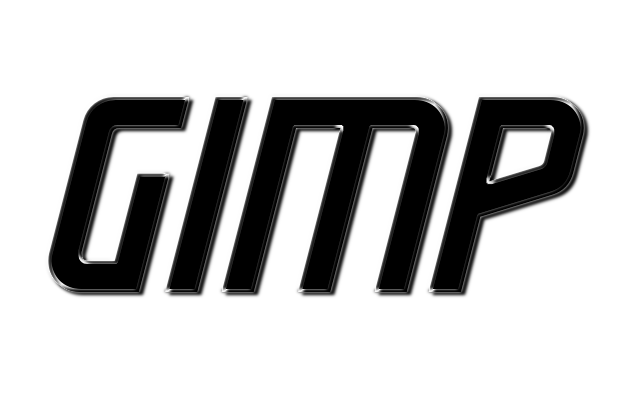
i need the help of you Gimp technicians and wizards
from studying PS tutorials, i have learned that metallic highlights on a stroke can look great
im trying to incorporate that in my text effect stuff and sometimes i get it right and sometimes not
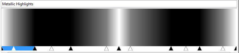
i guess one needs the right gradient for the job
tonight i had the idea to stroke a selection with a 75 brush, and then apply a layermask, but that was difficult to get right
also the angel is too random, because it depends on the outer lettersize
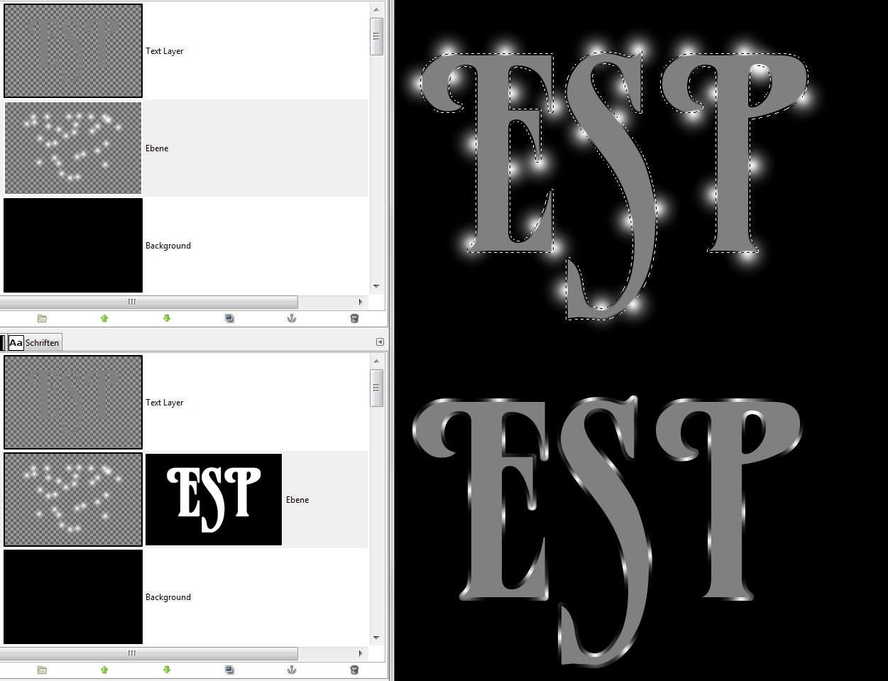
so i tried to make another gradient (attached below) and stroke it with the Repeat on Triangular
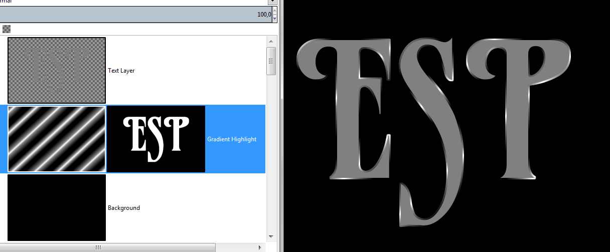
any ideas how to improve this technique ?
I found this tut on you tube. It's called, "Gimp : Chrome Metal Texture Tutorial' it's interesting how he didn't use a gradient, but instead he simply used a fuzzy paintbrush to create the different colors that give the text it's metallic look around the edge of the text.
 Login
Login Register
 Tweets
 FAQ
FAQ Advanced Search







 .
.