It is currently Mon Aug 10, 2026 4:11 pm


All times are UTC - 5 hours [ DST ]


Post new topic Reply to topic  [ 3 posts ] 
Author Message
 Post subject: Custom Font Wibbler Update to v0.1d Tabbed for Gimp 2.10
PostPosted: Sun Feb 01, 2026 2:58 pm  (#1) 
Offline
GimpChat Member
User avatar

Joined: Aug 08, 2016
Posts: 2855
Location: East Midlands of England
This update adds a taper option to the filter. The guide to using Wibbler in version 0.1c is still accurate and can be found here:

Version 0.1c Tabbed guide

Download, unzip and install the plug-in to your Gimp 2.10 user plug-ins folder.

Attachment:
Custom_Font_Path_Wibbler_v01d_Tabbed.zip [19.05 KiB]
Downloaded 67 times


Here is a pdf version of this version help guide should you require it.

Attachment:
Wibbler1d Help.pdf [1006.3 KiB]
Downloaded 112 times


The dialog menu changes in brief:

Tab 1:

Image

The blur option has been moved from Tab 2 to Tab 1: Change of wording has been used for the two reduce options.

Tab 2:

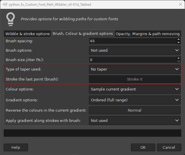
Image

Taper option added.
Stroke/unstroke last point with brush option added.

Tab 3:

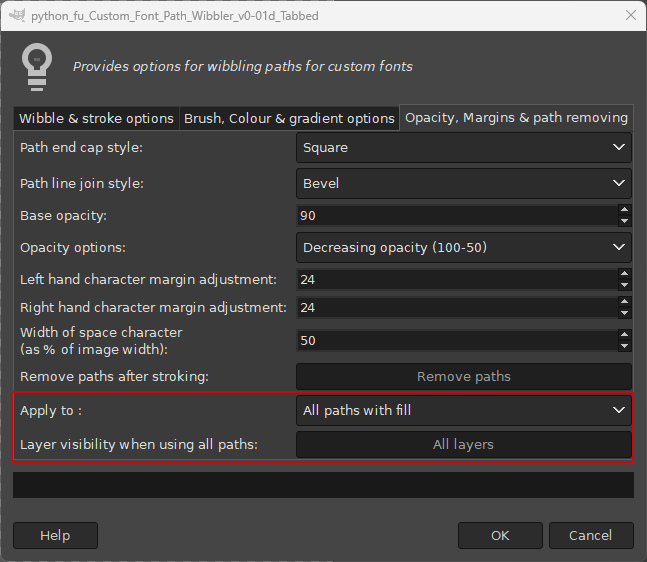
Image

Layer visibility option for use with other paths added.

You can choose to make only the top layer visible or all the layers visible (default) when stroking/filling all paths.

The Taper Option

The taper option can be applied with the currently applied brush. Choose an option from the drop down list:
Thin to Thick
Thick to Thin
Thin to Thick to Thin

Image

Characters with a stroke width of 40.0 and with the default ‘No taper’ option used for a round hard edged brush with the brush spacing set to 10. Thinner brush strokes require smaller values for the brush spacing option in order to create the illusion of a continuous stroke. (This also increases the time that it takes to stroke characters.)

Image

Taper set to ‘Thick to Thin’:

Image

Taper set as ‘Thin to Thick’:

Image

Taper set as ‘Thick to Thin to Thick’:

Image

‘Stroke the last point’ Option

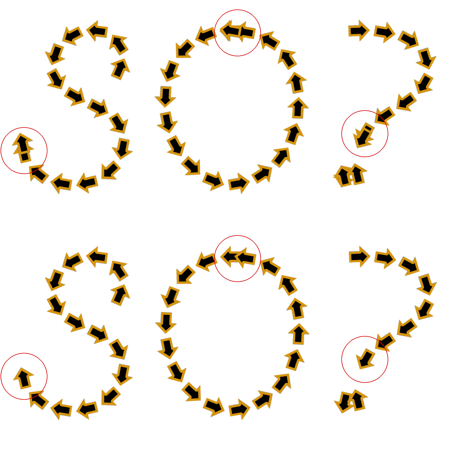
I have also added an option to stroke (default) or not stroke the last point in each stroke with the brush. This works well with continuous brush stroking; without it the character can be somewhat shortened. Characters stroked with animated or pipe brushes and larger amounts of spacing may look better with the option set to ‘Do not stroke’.

The example below uses an arrow brush. The top three characters show the untidy effect produced by the default option and the improved appearance when ‘Do not stroke’ is applied shown below.

Image

Reduce stroke width and Reduce Fill width Options

These two options now behave in a similar way. They reduce the size of the stroke width and fill width for each new character and layer created by a percentage amount.

The example below reduces each width by 20% for the five temporary paths used.

Image

Combining Characters

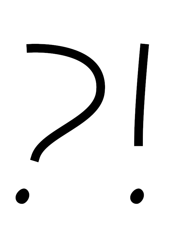
When stroking some character paths with a line (more noticeable with smaller widths) you may see holes in their centres: Think question mark, exclamation mark percentage sign etc. This may or not be the effect that you want.

Image

One solution would be to manually fill each of the offending characters.

There is another way (pedantic – yes) to combine the two as one character in Gimp so that the stroked and filled shapes will be merged into a single layer as shown below.

Image

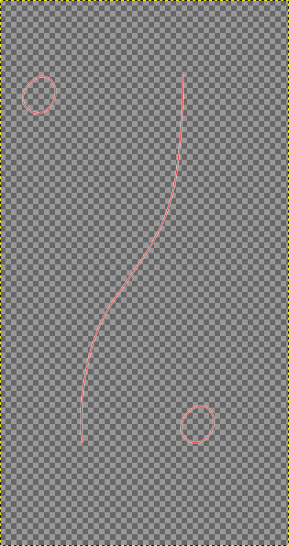
Locate the character that you want to have combined in the paths dock (my example uses the percentage sign character). Make it the only visible path and click on it to set it as the active path:

Image

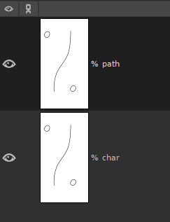
Duplicate the path and rename the copy with the ‘ path’ suffix:

Image

It will make life a lot easier if you add a pair of guidelines to your working image so that one just touches the far left-hand edge and one just touches the far right-hand edge of the character.

Image

When you work on the character with the ‘ path’ suffix, you want to remove parts of the path that you do not want to be filled and leave just the parts that are to be filled. Use the path tool and click on each unwanted anchor; hit the backspace key to remove it.

Image

You can see that the remaining strokes are touching the two guidelines that we added earlier.
Turn off the visibility for this character and make the original character, with the ‘ char’ suffix both visible and active in the main window. Remove any strokes that are not to be filled from this path by clicking on each unwanted anchor and pressing the backspace key.

Image

Now for the crucial step. You need to add a single anchor (not joined to any other stroke) if the current path does not already have an anchor point that touches the left-hand guide line. You will need to do the same for the right-hand guide line – add a single anchor if no anchor already touches the right-hand guideline. Hold down the Shift key and click to add a single unconnected anchor.

If you find that any of these combined characters suffer from unwanted cropping when you run the filter the reason will be that you have NOT added the single anchors to either the filled or unfilled characters.

Image

The filter outcome for the percent symbol character:

Image

And the outcome for a slightly different percentage character without the single anchors applied:

Image

Thankfully there are relatively few such characters and you may prefer to live with holes in them!!!

Have fun anyway.

_________________
Image
"Let no one steal your dreams."
Paul Cookson

Custom Font Links
2.10 Tools
Character Paths
White Bases


Share on Facebook Share on Twitter Share on Orkut Share on Digg Share on MySpace Share on Delicious Share on Technorati
Top
 Post subject: Re: Custom Font Wibbler Update to v0.1d Tabbed for Gimp 2.10
PostPosted: Sun Feb 01, 2026 3:04 pm  (#2) 
Offline
GimpChat Member
User avatar

Joined: Aug 08, 2016
Posts: 2855
Location: East Midlands of England
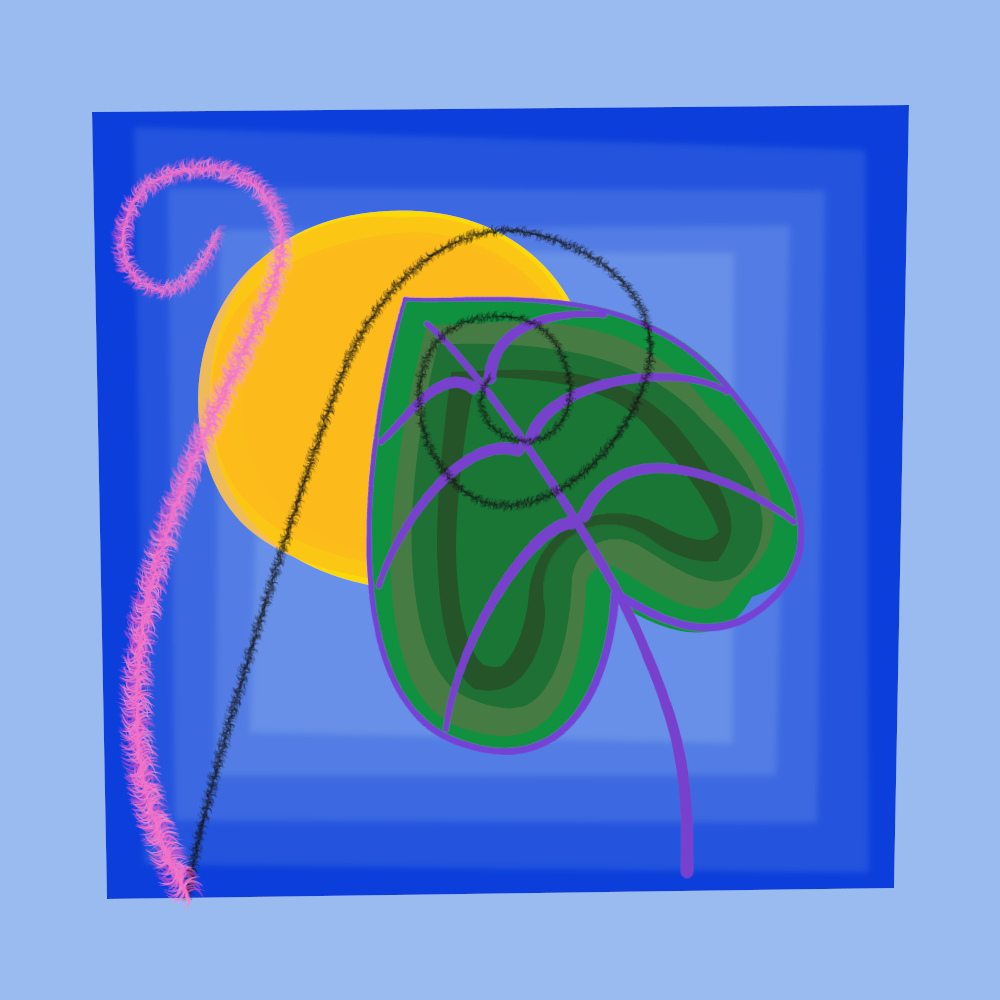
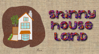
One of Issa's excellent boho pieces re-purposed with the taper option used to stroke the lines.

Image

_________________
Image
"Let no one steal your dreams."
Paul Cookson

Custom Font Links
2.10 Tools
Character Paths
White Bases


Top
 Post subject: Re: Custom Font Wibbler Update to v0.1d Tabbed for Gimp 2.10
PostPosted: Thu Feb 05, 2026 11:30 am  (#3) 
Offline
GimpChat Member
User avatar

Joined: Aug 08, 2016
Posts: 2855
Location: East Midlands of England
A few more hints for using Wibbler to make images...

An updated version of Wibbler to help you have fun...

Attachment:
Custom_Font_Path_Wibbler_v01e_Tabbed.7z [17.05 KiB]
Downloaded 50 times


A pdf version of this guide...

Attachment:
Boho_Helper.pdf [560.19 KiB]
Downloaded 85 times


A couple of brushes and gradients...

Attachment:
Resources.7z [44.38 KiB]
Downloaded 54 times


This is a follow-up guide to using Wibbler to help with images that are created from paths.

My example uses the following paths to create a simple square (1000x1000) Boho style image:

Image

The workflow:

Create the paths and save these in a base image.
Create a new destination image.
Generally work from the background to the foreground path objects.
Copy each path, paste it into the destination image and use Wibbler to stroke the path with your chosen settings.
Use undo (Ctrl + Z) if you are not happy with the outcome. (I use it a lot.)

How many Anchor Points?

Generally I try to keep the number of anchor points to a bare minimum when working with custom fonts but paths for images may require additional points to allow Wibbler to have a greater influence on the outcome.

Keep the number of anchors low but not too low – unless you want lots of changes of direction in a path.

Using a wibble factor of 12 the two paths below were stroked with the same number of temporary paths. The upper shape was drawn with only two anchors and the lower shape used eight fairly equally spaced out anchors.

Image

Use your gradients.

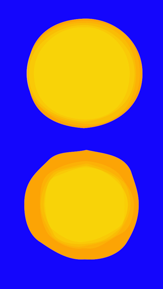
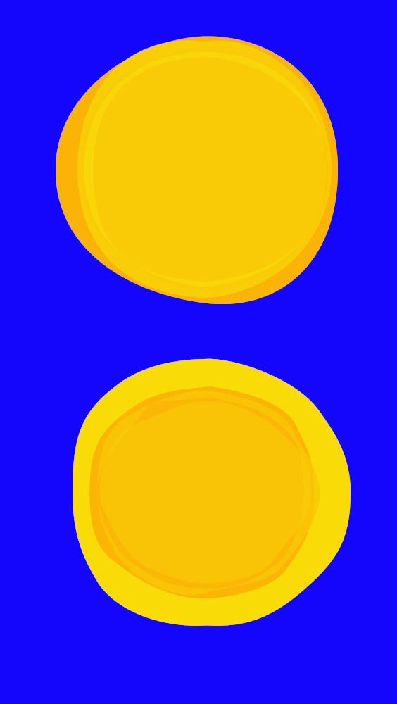
My sun shape needed filling with shades of yellow: The default setting uses colours taken from the current gradient in the order that they appear in the gradient...
Image

… whereas the random options choose colours at random from the current gradient:
Image

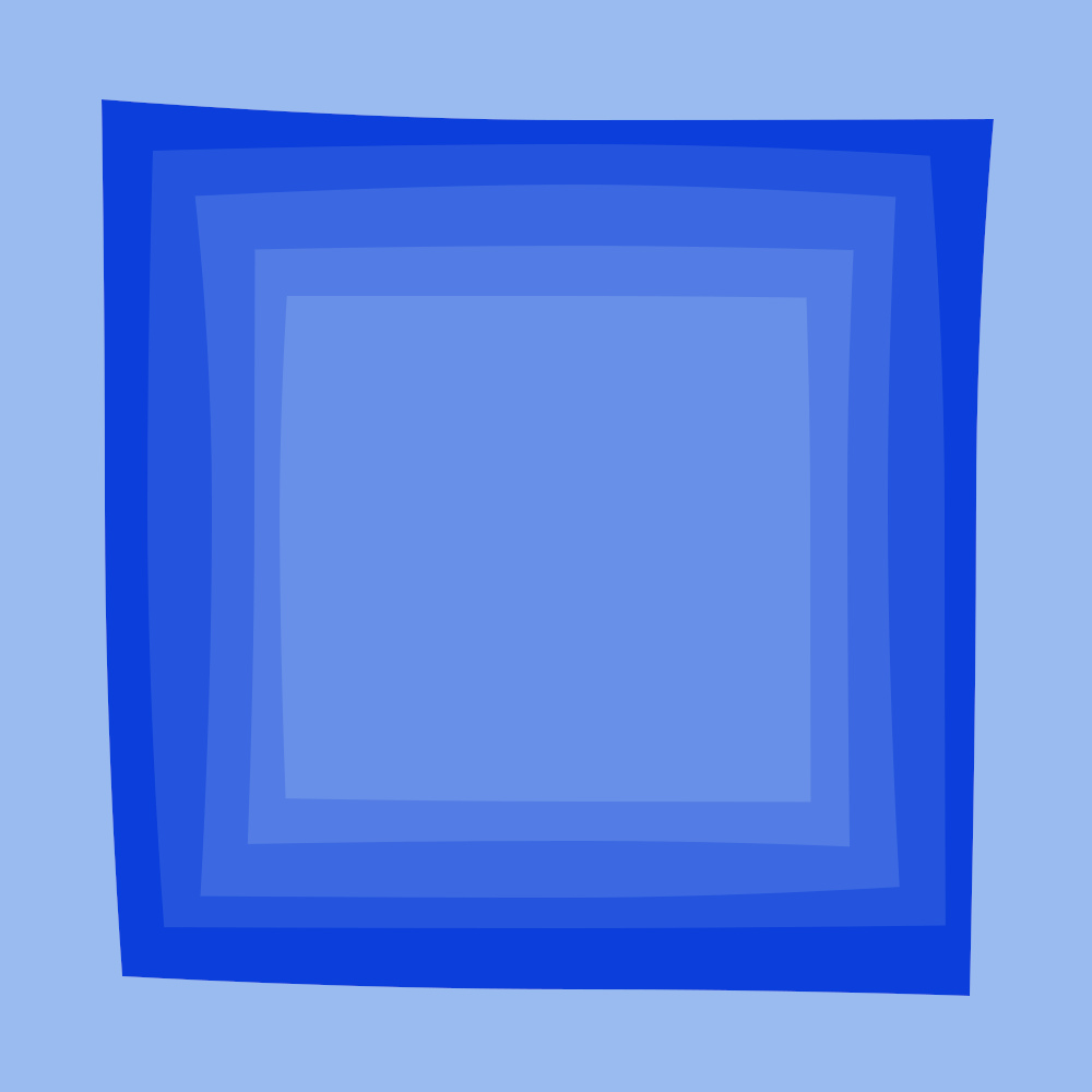
Choices, choices and more choices! The same process could be used for a background box...
Image

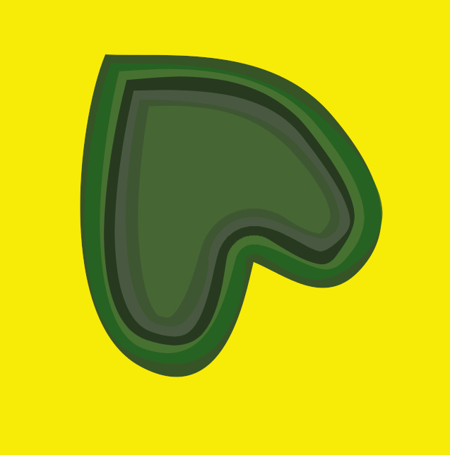
Make use of all the gradients you have acquired. The reduce fill size and blur option can add a lot of interest to shapes:

My leaf shape below used a full random gradient with seven temporary paths and a reduce fill amount value of 6.
Image

Or with a blur value of 10.0…

Image

Tapering Brush Strokes

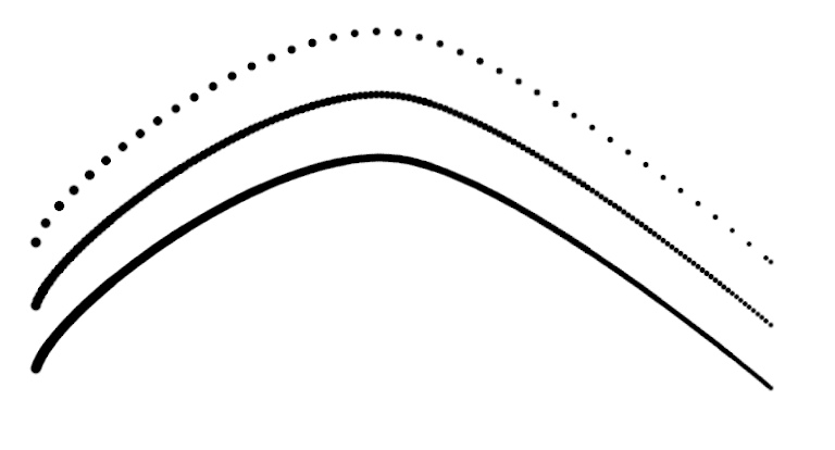
Use the taper options on Tab 2 of the dialog to shape the path lines using Stroke with the current brush option on Tab 1. Set the brush spacing to a low value; thinner lines require lower values in order to avoid gaps or unwanted textures in the lines.

The illustration below shows three versions of the same tapered line (roughly 800 pixels across) using a hard-edged round brush with a stroke width of 10: The spacings used were 40 (default), 10 and 5. I normally use a value of zero for the amount of wibble and a value of one for the number of temporary paths – but as always rules are there to be broken.
Image

One benefit of not applying any wibble effect is that you can use the reduce stroke width option with extra temporary paths to create an inner brush line with a different colour. I used this effect to create a set of veins for my earlier broad leaf shape. (When I created the path, I made sure that the order of the anchor points worked outwards from the centre vein so that all of the smaller veins would use the taper in the same direction.)

Image

Image

The veins with another leaf:

Image

Use your brushes

Play with all those different Gimp brushes that you have acquired over the years to add texture to your stroked lines.

I wanted to add brush texture to this basic frond-like path.

Image

I use a round hard-edged brush to find the spacing and stroke width sizes that look right. Once done I choose a suitable gradient to apply the colour and change to a textured brush and then I usually double the stroke width.

The brush that I used for my ‘frond’ was a simple shape that gave the spiky texture that I wanted for this plant stalk:

Image

My dialog settings:
Tab 1:
Amount of wibble: 4
Stroke path method: Stroke with current brush
Stroke width: 20.0
Number of temporary paths to create: 2
Tab 2:
Brush spacing: 3
Brush options: Random brush angle
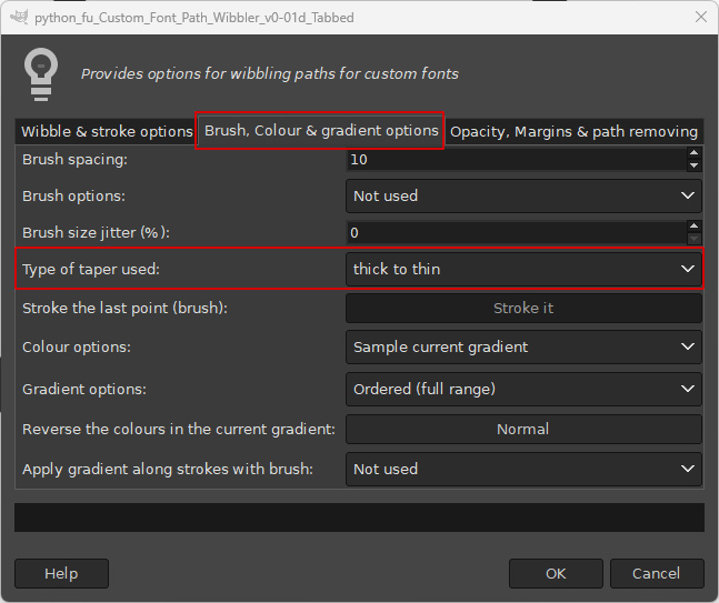
Type of taper used: thick to thin
Gradient options: Random (full range)
Tab 3:
Remove paths after stroking: Keep paths
Apply to: All paths without fill

I opted to keep the paths after stroking because that would allow me to re-apply the filter with different colours/stroke widths etc.

Some example filter outputs with different gradients:

Image

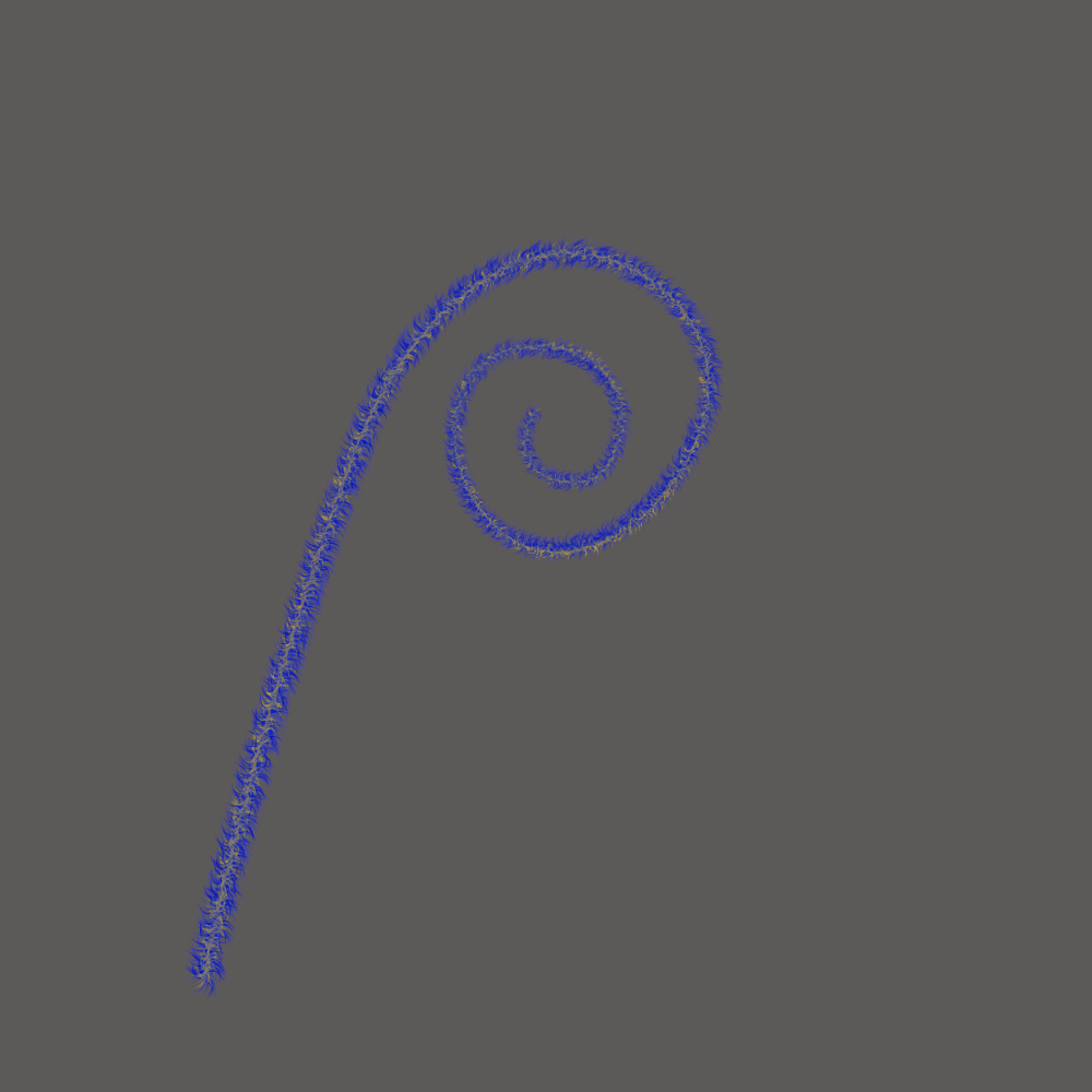
In my example below I increased the stroke width to 30.0 for the first run of the filter and then changed the coloured gradient and reduced the stroke width to 15:
Image

Putting the elements together:

Image

Have fun...

_________________
Image
"Let no one steal your dreams."
Paul Cookson

Custom Font Links
2.10 Tools
Character Paths
White Bases


Top
Post new topic Reply to topic  [ 3 posts ] 

All times are UTC - 5 hours [ DST ]


* Login  


Powered by phpBB3 © phpBB Group