wbool63 wrote:
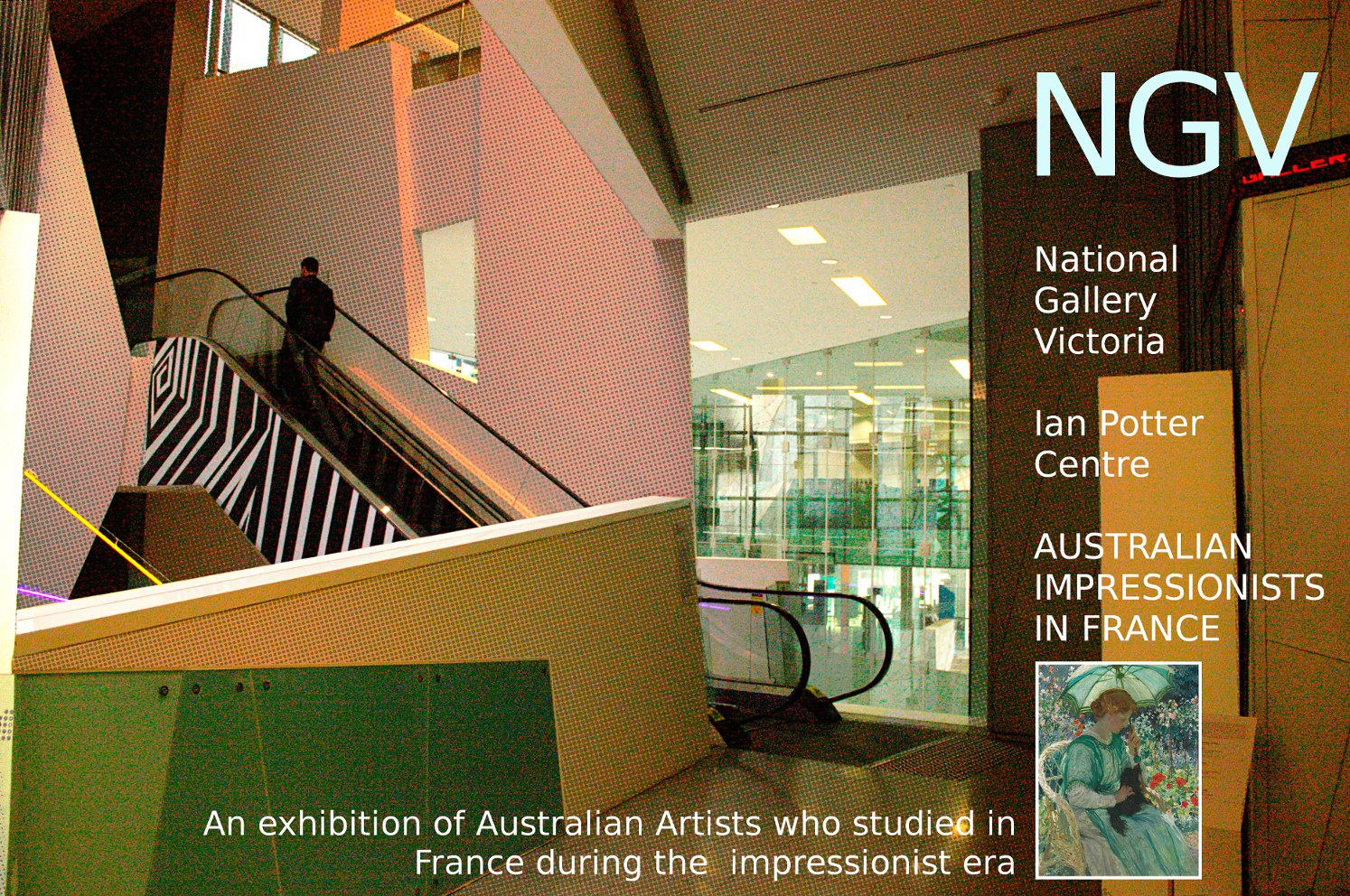
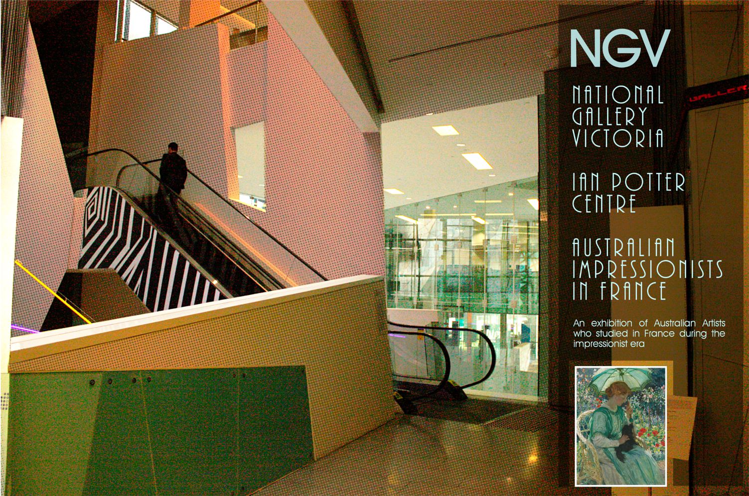
@ CRogers, yes you are right, there was an extra space in the writing. I include an updated version with your suggestion of an underlying blackish bedding for the text. I tried just the lower caption but found it unbalanced, so I did the same for the other text and used a layer mask to "unmask" the little notice board. I am not convinced that the under lie of a blackish (46% normal) is beneficial but I agree that it defines the text area.
Almost what I had in mind. I'd run the black all the way from top to bottom, and exclude the text at the base (it doesn't really need it. I'd also decrease the size of the font at the bottom, and maybe the side too. If you post the original base photo I'll take a stab at it to show you what I mean (if you'd like, of course).

I love what you did with the back dots, by the way. I think others mentioned that, but it really works with the contractivism of the building's appearance... in fact, you might try a constructivist approach to using the text to accentuate the lines of the architecture. (with help of the perspective tool).
 Login
Login Register
 Tweets
 FAQ
FAQ Advanced Search












 )
) 
.jpg)