I love (
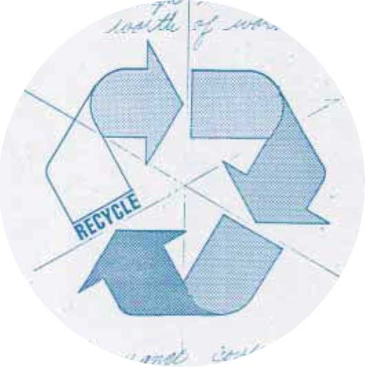
not really) how some photo and artist sites online try to lay claim to the recycle logo as if it belonged to them. Fortunately, it does not, and since the current rendition of the logo is online for all use (Public Domain). Interestingly enough, the winning image entry by Gary Anderson isn't shown in Wikipedia. I believe the actual winning image should be shown, as well. This is what the actual image looks like:
It seems we have flipped the logo vertically, not that it makes any difference. The motto is the same, irrespective of its positioning.
I created a variant from the drawing and then created six separate path layers. The result gives me more leverage over applying gradients and strokes to give the logo more POP!
Should make for some interesting examples down the road.

_________________
"In order to attain the impossible, one must attempt the absurd."
~ Miguel de Cervantes
 Login
 Register
 Tweets
 FAQ
 Advanced Search