It is currently Thu Nov 19, 2026 5:48 am


All times are UTC - 5 hours [ DST ]


Post new topic Reply to topic  [ 33 posts ]  Go to page 1, 2  Next
Author Message
 Post subject: Signature of the week... My entry...
PostPosted: Sat Apr 24, 2010 6:17 pm  (#1) 
Offline
GimpChat Member

Joined: Apr 24, 2010
Posts: 84
I'm part of a gaming community and they have this SOTW (sig of the week) contest... I placed another entry and the theme was... WATER

I'm a scuba diver myself so that's why... :cool

So here's my entry..

Image

Regards


Last edited by Bloodwell_ on Sun May 02, 2010 11:52 am, edited 13 times in total.

Share on Facebook Share on Twitter Share on Orkut Share on Digg Share on MySpace Share on Delicious Share on Technorati
Top
 Post subject: Re: Signature of the week... My entry...
PostPosted: Sat Apr 24, 2010 7:03 pm  (#2) 
Offline
GimpChat Member
User avatar

Joined: Apr 07, 2010
Posts: 14182
It seems to me it is all the same color value and everything is lined up in a row.
I think, if you want to add some depth to it, you should make your subject which must be the iron man your focal point, then do some blending and action around it in some lighter and midtones.
There is a very good tutorial in here by Penguin you could check out for some ideas how to blend your iron man in with the background.
hope this helps. cheers.

Penguin tutorial

_________________
Image


Top
 Post subject: Re: Signature of the week... My entry...
PostPosted: Sat Apr 24, 2010 7:04 pm  (#3) 
Offline
GimpChat Member

Joined: Apr 24, 2010
Posts: 84
Thanks for the help mate....

I'll check the tut


Top
 Post subject: Re: Signature of the week... My entry...
PostPosted: Sat Apr 24, 2010 7:09 pm  (#4) 
Offline
GimpChat Member

Joined: Apr 24, 2010
Posts: 84
Just checked the tut and it's a bit to hard for me :cool I might check it out later when I get a little better... I don't know what half of the things do.. that's why I'm going to wait a little longer maybe next week or so..

I don't see how you guys got to know what everything does and stuff... give me some tips.. I'm sure you guys started just like me.. Not knowing what displacing and desaturating does.. So how did you guys get to know that :mrgreen:

Let me know

Thanks in advance


Top
 Post subject: Re: Signature of the week... My entry...
PostPosted: Sat Apr 24, 2010 7:25 pm  (#5) 
Offline
GimpChat Member
User avatar

Joined: Apr 07, 2010
Posts: 14182
Tell you what I will let you know when I know cuz I have only been using GIMP since before Xmas sometime. Just follow the tute and ask lots of questions......

_________________
Image


Top
 Post subject: Re: Signature of the week... My entry...
PostPosted: Sat Apr 24, 2010 7:35 pm  (#6) 
Offline
Retired Staff
User avatar

Joined: May 22, 2008
Posts: 6946
Location: Somewhere in GIMP
Check out Jolie's basics tutorial.

GIMP Basics Beginner Video Tutorial

_________________
Image
World War IV will be fought with sticks and stones. - Albert Einstein


Top
 Post subject: Re: Signature of the week... My entry...
PostPosted: Sat Apr 24, 2010 7:55 pm  (#7) 
Offline
GimpChat Member

Joined: Apr 24, 2010
Posts: 84
I did this tut for the sig and this is what I got..

Image

It's nice... I hope I win

But I just find it annoying that I don't know what the hell I'm doing half of the time..

but hey it's a nice result

I'll check that jolie's tut tommorow cya guys...


Top
 Post subject: Re: Signature of the week... My entry...
PostPosted: Sat Apr 24, 2010 9:49 pm  (#8) 
Offline
Retired Staff
User avatar

Joined: May 22, 2008
Posts: 6946
Location: Somewhere in GIMP
That's a BIG improvement. You might not know what you are doing yet, but you are putting information into your head that perhaps the next time you need to do something you will have the knowledge.

GIMP learning is an ongoing process. You do one thing that leads to another, then another, then another ...

_________________
Image
World War IV will be fought with sticks and stones. - Albert Einstein


Top
 Post subject: Re: Signature of the week... My entry...
PostPosted: Sun Apr 25, 2010 3:33 am  (#9) 
Offline
GimpChat Member

Joined: Apr 11, 2010
Posts: 545
Location: In the mini-chat, saying silly things
I follow tutorials with new techniques (to me) in it several times until I get why I'm doing it. And also so that I remember it for next time. Especially when I was just starting out with GIMP I used to have these lightbulb moment of understanding why a certain step was needed after I did the tutorial for the 3rd time.

Your second sig is much much better then the first. :bigthup

_________________
Image


Top
 Post subject: Re: Signature of the week... My entry...
PostPosted: Sun Apr 25, 2010 5:04 am  (#10) 
Offline
GimpChat Member

Joined: Apr 24, 2010
Posts: 84
thanks


Top
 Post subject: Re: Signature of the week... My entry...
PostPosted: Sun Apr 25, 2010 6:56 am  (#11) 
Offline
GimpChat Member
User avatar

Joined: Apr 07, 2010
Posts: 14182
Bloodwell_
Your second sig is much better but you still need some contrast to make your Ironman stand out. Try using softer muted colors in your background and put some light behind him especially behind the dark part of his suit.
If you keep him on your top layer while you are working you won't have to worry about painting over him..
You can use color values (lights vs darks) to make things appear 3 dimensional and to bring your man to the front like he is coming out of the trees or forest...

_________________
Image


Top
 Post subject: Re: Signature of the week... My entry...
PostPosted: Sun Apr 25, 2010 12:32 pm  (#12) 
Offline
GimpChat Member

Joined: Apr 24, 2010
Posts: 84
I'll try putting a supernova effect behind him I like it and it looks about the same as his light in his chest..

Btw can you explain that stuff about the 3D and stuff..

Don't have an idea what you are talking about there :(


Top
 Post subject: Re: Signature of the week... My entry...
PostPosted: Sun Apr 25, 2010 1:06 pm  (#13) 
Offline
GimpChat Member

Joined: Apr 24, 2010
Posts: 84
Check the first post I added some light and stuff let me know what you think now..


Top
 Post subject: Re: Signature of the week... My entry...
PostPosted: Sun Apr 25, 2010 2:14 pm  (#14) 
Offline
GimpChat Member
User avatar

Joined: Apr 07, 2010
Posts: 14182
They are getting better. I would pick the 3rd one but I would like to see what others say....
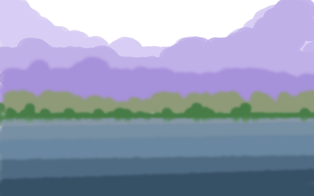
Just keep this in mind that dark colors give the impression of closeness and lighter grayed down colors look farther away which gives you the 3D look. Maybe that blue is too dark.....

_________________
Image


Top
 Post subject: Re: Signature of the week... My entry...
PostPosted: Sun Apr 25, 2010 2:21 pm  (#15) 
Offline
GimpChat Member

Joined: Apr 24, 2010
Posts: 84
I like the one without the blue the most... TBH


Top
 Post subject: Re: Signature of the week... My entry...
PostPosted: Sun Apr 25, 2010 2:50 pm  (#16) 
Offline
GimpChat Member
User avatar

Joined: Apr 07, 2010
Posts: 14182
This is just a demo pic, not meant to be a work of art just to show you how colors can make it look 3D. The more grays you add in the farther away it looks so then you can have your iron man jump out at you. If you sit way back from screen you will see that the hills look far away. Hope this helps some.
Image

_________________
Image


Top
 Post subject: Re: Signature of the week... My entry...
PostPosted: Sun Apr 25, 2010 2:57 pm  (#17) 
Offline
GimpChat Member

Joined: Apr 24, 2010
Posts: 84
Saved that pic :cool

Thanks mate I'll keep that in mind


Top
 Post subject: Re: Signature of the week... My entry...
PostPosted: Sun Apr 25, 2010 3:07 pm  (#18) 
Offline
GimpChat Member

Joined: Apr 24, 2010
Posts: 84
http://forums.ukcs.net/viewtopic.php?f=35&t=48066

This is the link to the webpage where I entered

Can you guys review the other sigs to and check if I have any chance or not?

regards and thanks in advance


Top
 Post subject: Re: Signature of the week... My entry...
PostPosted: Sun Apr 25, 2010 4:13 pm  (#19) 
Offline
GimpChat Member
User avatar

Joined: Apr 07, 2010
Posts: 14182
Some are very good and some not so good but if you work a bit on your depth, I think you have a pretty good chance....

_________________
Image


Top
 Post subject: Re: Signature of the week... My entry...
PostPosted: Mon Apr 26, 2010 10:38 am  (#20) 
Offline
GimpChat Member

Joined: Apr 24, 2010
Posts: 84
I made another one.. I don't know if it's better.. or less good..

What I do know is that about in the middle of the screen there's like this line.. And I have no idea how to remove it.. If anyone can tell me it would be much appreciated..


Top
Post new topic Reply to topic  [ 33 posts ]  Go to page 1, 2  Next

All times are UTC - 5 hours [ DST ]


* Login  


Powered by phpBB3 © phpBB Group